Quality Dashboard - The Creation of an Integrated Information Tool
In the bustling world of software development, ensuring top-notch quality is a shared responsibility that involves every individual within an organisation. From crafting impeccable quality requirements to validating the final product, every step counts. However, the question arises as to how we effectively measure and assess the collective efforts of multiple departments collaborating in an organisation.
Different Sources of Quality Measurements
Within our Product House, each subgroups will naturally use specialised tools to ensure quality of their respective field:
- Developers use different tools to measure the code coverage of their work,
- Quality Engineers use different tools to assess the functional automation coverage, and JIRA for reporting bugs,
- Product and Support teams rely on JIRA for tracking bugs and managing project delivery.
The struggle of having multiple sources to measure product quality lies in the complexity of consolidating and analysing diverse data. It can be challenging to gain a cohesive and comprehensive view of quality, leading to potential difficulties in making informed decisions and taking appropriate actions for improvement. Additionally, managing and interpreting data from various sources may require significant time and effort.

This situation inspired us to create a tool that acts as a single, comprehensive source for consolidating and visualising information, promoting collaboration, and ensuring shared responsibility for quality across teams.
ℹ️ We have named this tool “Quality Dashboard”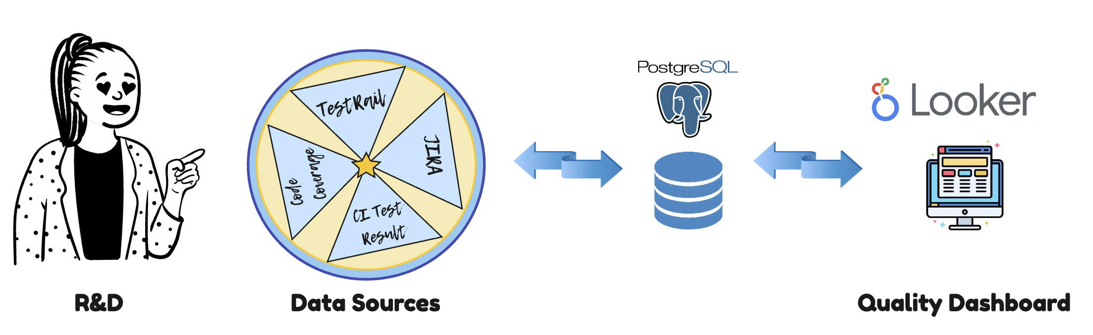
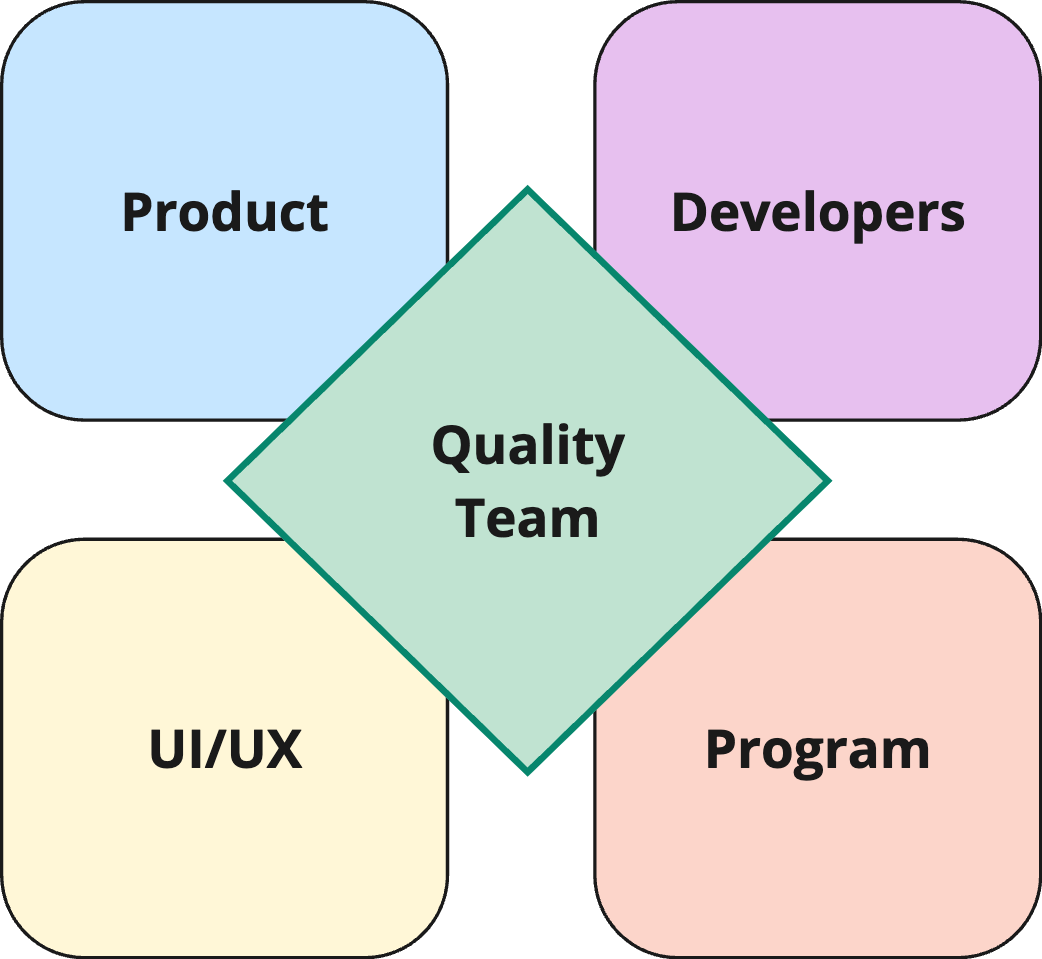
Empowering Collaboration
One of our end goals is to break down barriers between designers, product managers, developers, the quality team, and support teams: we aim to make quality measures a shared responsibility among all stakeholders within the organization, feature team, scrum team, or product unit.
We want this tool to provide factual data and valuable insights, allowing engineers, leaders, and managers to effectively measure progress in various processes and projects.
The quality dashboard should serve as a visual representation of critical information, with a specific focus on ongoing quality-related activities within the Product and R&D department. It should facilitate continuous monitoring and assessment of quality management metrics and key performance indicators (KPIs).
Lets first deep dive into some basics!
What is a KPI?
Key Performance Indicators (KPIs) is a measure of how teams are performing to meet the overall business goals and objectives. KPIs can be used to track the performance of the different functions within an organisation as well as individual team members.
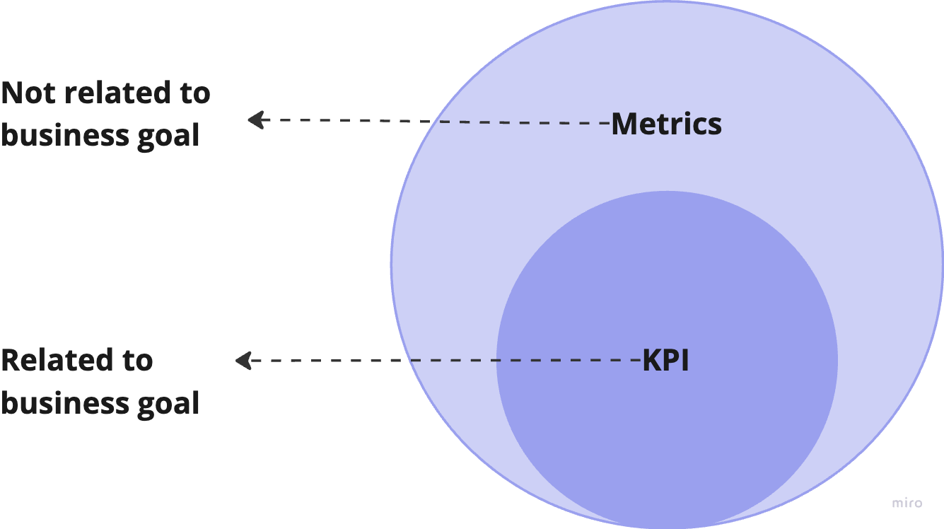
KPIs vs Metrics
Key performance indicators are data that show you just how good you are at attaining your business goals. Meanwhile, metrics track the status of your business processes.
| KPIs | Metrics |
|---|---|
| All KPIs are metrics. | All Metrics are not KPIs. |
| KPI gives a holistic view of the performance of different functions in an organisation. | Metrics gives a picture of how different individual activities rolled out within the functions are progressing. |
| KPI tells where exactly the team stands with respect to the overall business goal. | Individual Metrics do not give any insights on their own. |
Realistic example of KPI vs Metrics
Let’s consider a realistic example for a Key Performance Indicator (KPI) and metrics in the context of quality!
Metrics:
-
Number of Defects: This metric tracks the total number of defects or bugs identified in the software during a specific period, say a month.
-
Lines of Code (LOC): This metric measures the total number of lines of code written for the software during the same period.
KPI: Defect Density: Defect Density is calculated as the ratio of the number of defects to the lines of code. The formula is: Defect Density = Number of Defects / Lines of Code.
Difference between KPI and Metrics:
KPI: In our example, “Defect Density” is the KPI that indicates the overall quality of the software development process.
Metrics: In our example, “Number of Defects” and “Lines of Code” are metrics that contribute to the calculation of the “Defect Density” KPI.
In summary, the “Defect Density” KPI provides a holistic view of the software’s quality, while the “Number of Defects” and “Lines of Code” metrics offer specific data points that help evaluate the quality aspect represented by the KPI. By tracking and analysing these metrics, the team can take appropriate actions to improve the software’s quality if the “Defect Density” value is not meeting the desired target.
Strong vs weak KPIs
Let’s consider an example of a good and a bad Key Performance Indicator (KPI) in the context of software quality:
Strong KPI: Bug Leakage Rate
Definition: The percentage of defects or bugs that are identified by customers after the software has been released to production.
Why it’s strong: The Bug Leakage Rate is an essential KPI for measuring the effectiveness of the software testing and quality assurance processes. A low Bug Leakage Rate indicates that the testing efforts are successful in detecting and fixing defects before they reach the customers. It reflects the overall quality of the software and how well it meets user expectations.
Weak KPI: Number of Test Cases Executed
Definition: The total count of test cases executed during the testing phase.
Why it’s weak: Tracking the total test cases executed is relevant but using it as a standalone KPI can be misleading. It doesn’t measure testing quality, defects found, or critical areas tested. Relying solely on this KPI may prioritise quantity over quality, impacting testing effectiveness.
In summary, A strong software quality KPI should directly relate to testing and quality assurance effectiveness, offering valuable insights into overall quality and user satisfaction. In contrast, a weak KPI may misguide testing efforts and overlook critical defects.
Quality Dashboard Architecture
Three-Tier Architecture had been used to build the Quality Dashboard.
- The Data layer : PostgreSQL which manages data storage and integrity.
- Business layer: handles application logic and calculation of KPIs.
- Presentation Layer: deals with user interfaces and interactions.
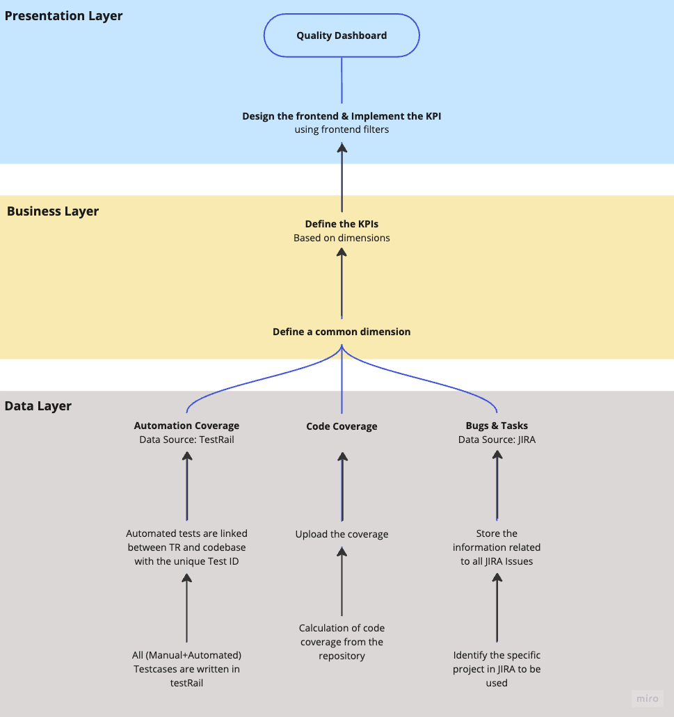
The Data Layer performs the vital task of collecting information from various sources through their respective APIs and storing it in our database. Our Quality Tech Leads played a crucial role in achieving this objective.
The Business Layer’s responsibility was to establish common dimensions that allowed different data sources to link to each other while also aligning with our business requirements. In our case, these common dimensions were different products (Modules) and different projects (EPIC), which will be discussed in detail in the next section. Defining these dimensions was critical as they laid the foundation for designing the KPIs we aimed to follow.
The Presentation Layer took charge of building the dashboard in Looker Studio, utilising its rich yet user-friendly interface. This enabled us to blend data from various sources and construct formulas to create the defined KPIs. Quality Managers were responsible for overseeing both the Business and Presentation Layers.
We initiated the project in late September 2022 and made it generally available by early November. Building the entire dashboard took approximately 1.5 months, as most of the logic and formulas were implemented on the frontend using Looker Studio, rather than coding.
Exploring the Rich Insights of the Quality Dashboard
The Quality Dashboard encompasses four main pages, outlined as follows:
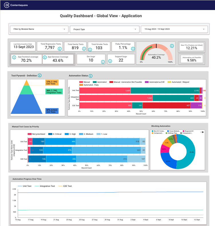
Global View
Contentsquare’s primary product, User Analytics, is comprised of various sub-products known as modules in R&D terminology. When accessing the Global View, one of the crucial dimensions to consider is the module selection. By choosing a specific module, users gain access to a comprehensive page displaying all quality-related metrics and KPIs. The option to select a module allows for a more detailed and granular analysis.
Data source
JIRA, TestRail, Code Coverage, Automation Flakiness.
Metrics/KPIs
The standard information that we typically observe in the global view is as follows:
- Total number of Test-case (Regression/Sanity/Smoke)
- Test Pyramid
- Automation Status per layer (test pyramid)
- Automation coverage and its Progress over time
- Code coverage and its progress over time
- Bugs during development vs Bugs coming from support/customer
- Bugs per testing environment
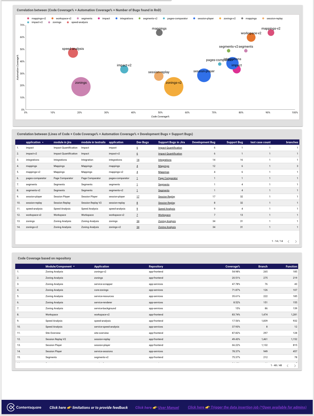
- Correlation between automation coverage/code coverage/bug found
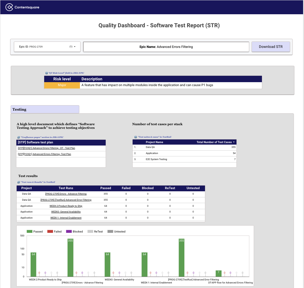
STR (Software Test Report)
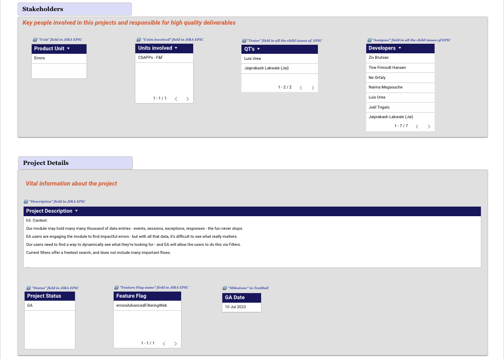
The page depicts the active development of a specific feature. By simply selecting the corresponding project (typically referred to as an EPIC in JIRA), all the pertinent information related to that project is presented in the form of a structured document known as an STR (Software Test Report).
The STR comprises the following information, and it is automatically generated when the project (EPIC) is selected.
- Risk Level
- Link to the STP
- Number of test cases per technical stack (Mobile/Data Collection/Data Pipeline/Web)
- Test execution report
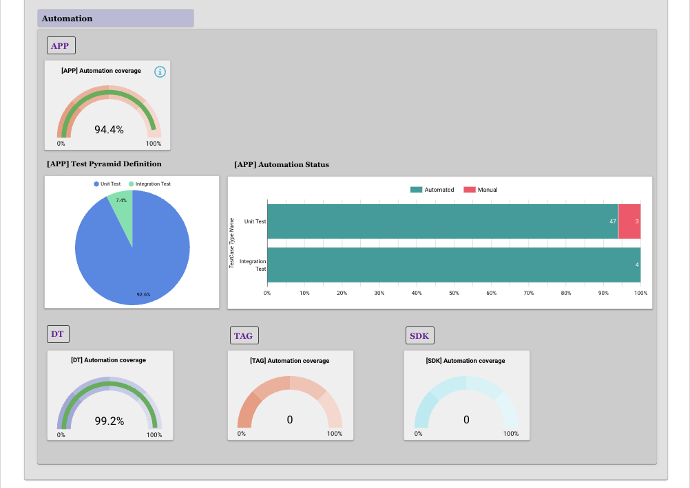
- Automation coverage per technical stack (Mobile/Data Collection/Data Pipeline/Web)
- Stakeholders and Basic project details
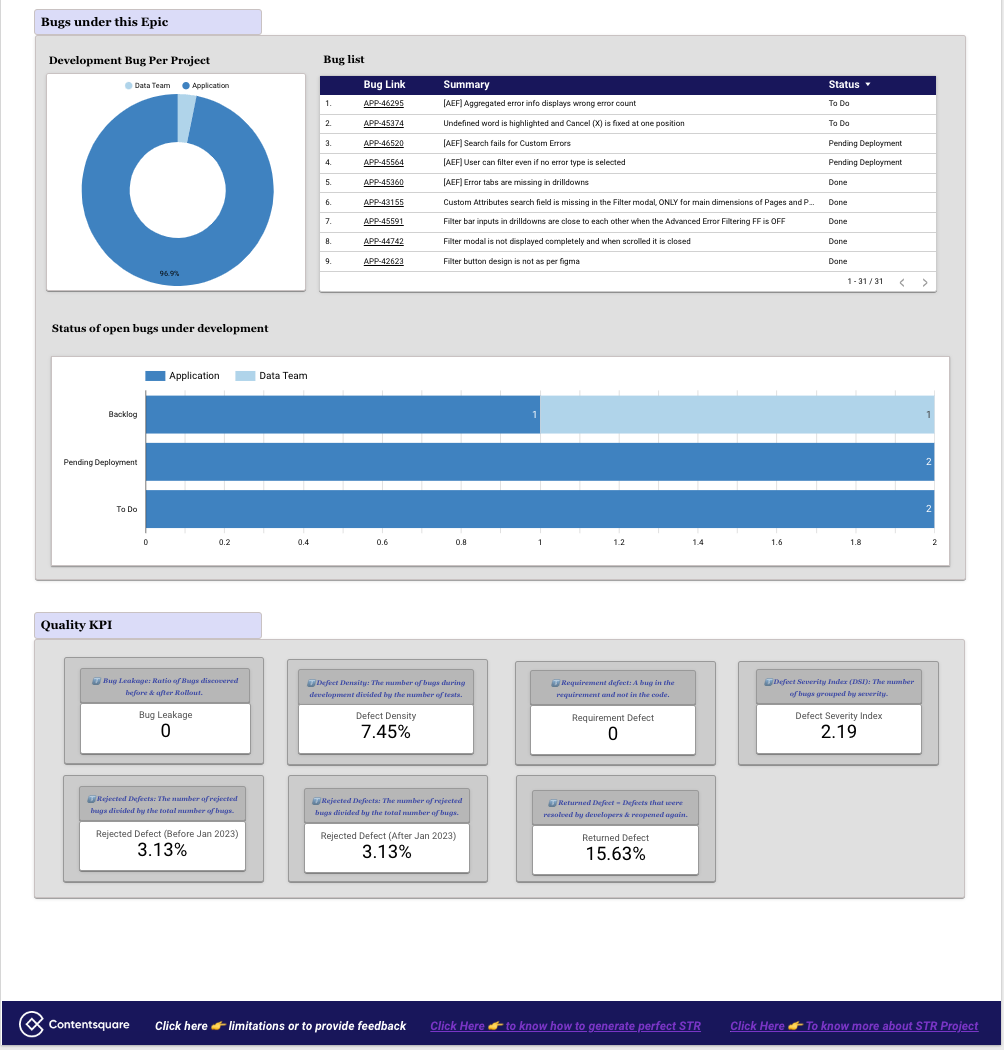
- Bug details
- Quality KPIs
Data source
TestRail, JIRA, Confluence.
Metrics/KPIs
Let’s examine a few essential Key Performance Indicators (KPIs).
-
Bug Leakage
- Ratio of Bugs discovered before & after roll-out.
- Bug Leakage = (Number of Production Bug / (Number of bug in Development + Number of bug in Production)) * 100
-
Defect Density
- The number of confirmed bugs in a software application/module/project during the period of development, divided by the number of tests.
- Defect Density % = (Total Defect count/Total Number of Test cases) * 100
-
Requirement Gap
- A software bug, which is a flaw or fault in the product design, requirement, or operation that causes it to produce an incorrect or unexpected result, or to behave in unintended ways.
- Requirement Bugs = Typically denotes the Bug Type in JIRA as => Requirement Gap
- Requirement Gap = (Number of Design Bug/Total number of Bugs) * 100
-
Defect Severity Index (DSI)
- DSI offers an insight into the quality of the product under test and helps to measure the quality of the test team’s efforts.
- DSI = Sum of (Defect * Severity Level) / Total number of defects.
- Severity Level:
- 🚨🚨🚨 Critical - 3
- 🔥🔥 Major - 2
- 🙁 Minor - 1
-
Returned Bug
- It is a KPI that shows how many of the defects that were resolved by the developers are reopened again.
- Returned Defects = (Number of Reopened Defects / Total Number of Defect opened) * 100
-
Rejected Bug
- Measures the effectiveness of a testing team. The rejected defect ratio, is the number of rejected bug reports divided by the total submitted bug reports.
- Rejected Defects = (Number of rejected Defects / Total Number of Defect opened) * 100
There are below categories of rejected bugs:
- Cannot Reproduce
- Configuration issues
- Declined
- Duplicate
- Need more info
- Infrastructure issue
- Wrong environment
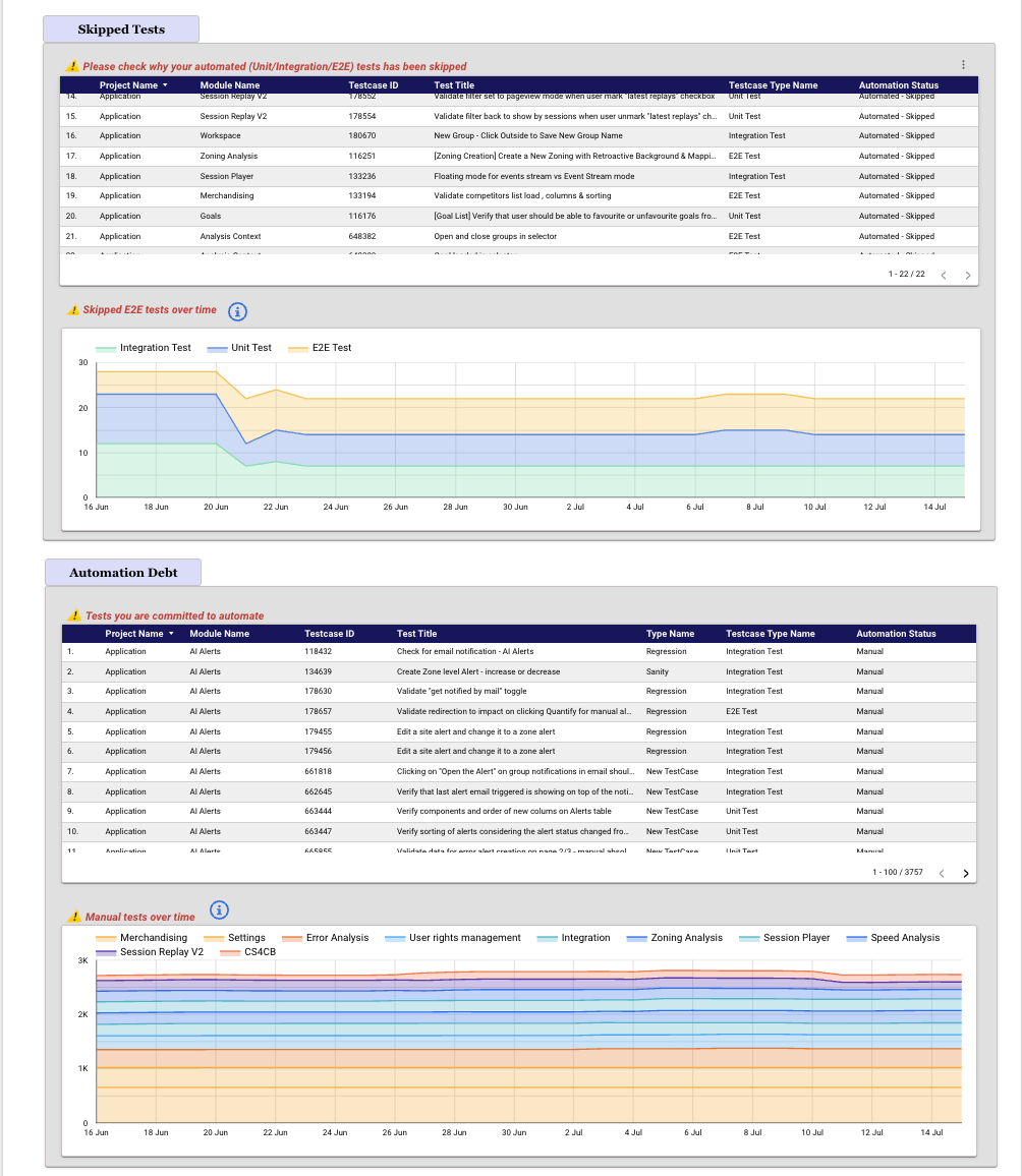
Test Debt
Describes the extent of technical or automation debt in our test cases, including:
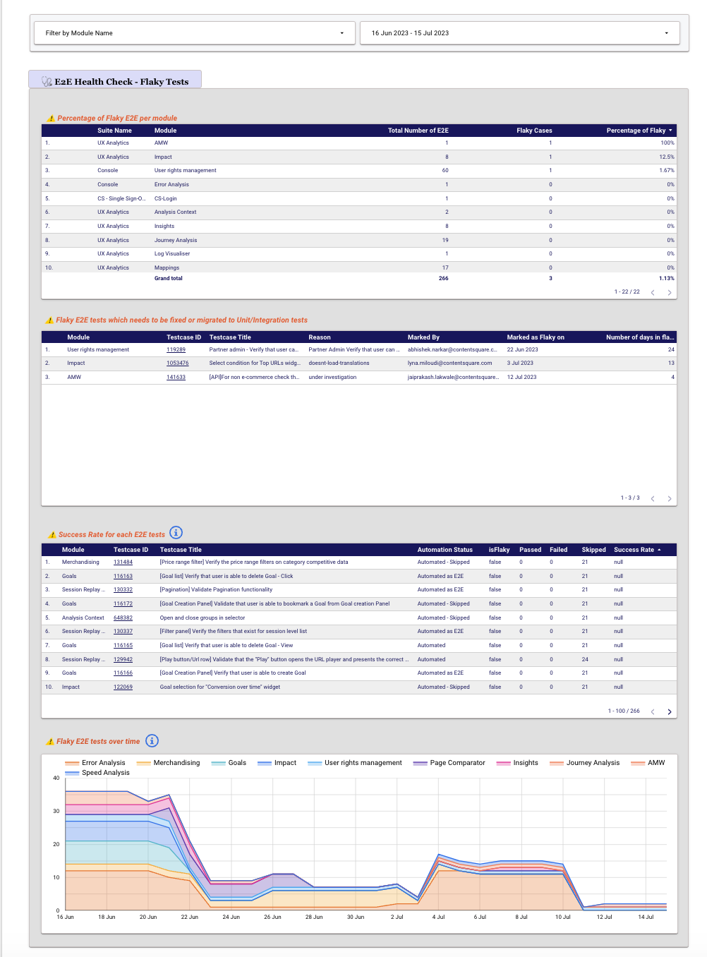
- The flaky nature and success rate of each automated End-to-End (UI) test.
- How many tests can be automated but not automated yet (are currently performed manually).
- Identifying the automated tests (Unit/Integration/E2E) that have been skipped.
The option to select a module, and the date range allows for a more detailed and granular analysis.
Data source
TestRail, Flakiness in the UI tests, Code coverage.
Metrics/KPIs
A few metrics in this section:
- Percentage of flakiness per module
- Flaky UI tests which needs to be fixed or migrated to Unit/Integration tests
- Success Rate for each UI tests
- Flakiness over time (which is suppose to be reduced)
- Please check why your automated (Unit/Integration/E2E) tests has been skipped
- Skipped tests over time (which is suppose to be reduced)
- Tests you are committed to automate
- Manual tests over time (which is suppose to be reduced)
Discrepancies
In our TestRail tool, we handle an extensive collection of over 11,000 regression tests. Keeping these test cases up to date and aligned with the work of our 40+ Quality Engineers (QEs) is a challenging task. Therefore, this particular section of the Quality Dashboard (QD) is designed to automatically identify potential discrepancies. It allows filtering based on specific scopes (modules) or individuals (created by) for better management and analysis.
Data source
TestRail, JIRA.
Metrics/KPIs
Now, let’s examine a few discrepancies among all.
- Unit and Integration tests can not be flaky. Please check your solution again!
- The tests are marked as “Manual-Automation Not Feasible”, yet it was tagged as Unit/Integration Tests. Please Review!
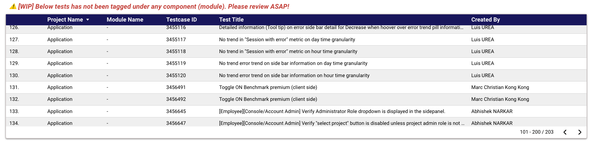
- Below tests has not been tagged under any component (module). Please review ASAP!
- Below tests are mentioned as “Blocking Automation” But automation status is already automated. Please review!
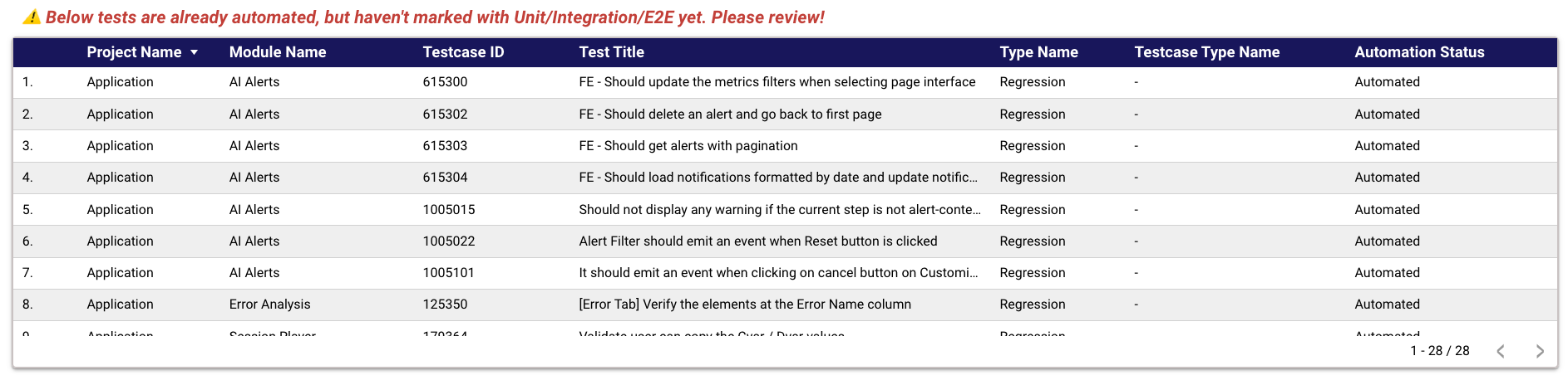
- Below tests are already automated, but haven’t marked with Unit/Integration/E2E yet. Please review!
- Wrong JIRA references has been mentioned. Please review!
What we’ve achieved
A year has passed since we launched the initial version of quality dashboard, and…
- We have gained a clear understanding of the quality-related investment throughout our entire product portfolio, encompassing R&D & Product.
- Test pyramid
- Automation
- We now have a comprehensive understanding of our challenges (Integration Tests) and our accomplishments (Unit tests). 📚 Read How we reshaped our Test Pyramid.
- We have successfully established a common objective across all teams to enhance automation and continually monitor its progress.
- Before deploying any new feature in Production, we can effortlessly assess the automation coverage. The different teams are well-informed in this regard.
- Maintaining our standard for managing approximately 11,000 test cases has become more convenient.
Conclusion
The Quality Dashboard serves as a powerful tool that empowers teams to drive quality improvements and make data-driven decisions. By providing a comprehensive overview of key metrics, test results, and actionable insights, it enables stakeholders to gain deep visibility into the quality of their products or projects. With its user-friendly interface and customizable features, the Quality Dashboard facilitates efficient monitoring, analysis, and collaboration across teams.
By harnessing the power of the Quality Dashboard, organisations can enhance their quality assurance processes, streamline workflows, and ultimately deliver exceptional products to their customers. Embrace the power of data and insights provided by the Quality Dashboard to elevate the quality of all stakeholder’s work and drive success in your endeavours.
Coming next
First In the quality dashboard, we have identified a crucial missing piece of information related to service disruptions. These disruptions are significant outcomes resulting from all quality-related activities across various teams, including developers, quality engineering, and DevOps. The reason behind this absence is that we currently lack component (module) information for service disruptions across all teams. However, once we internally gather and incorporate this information, it will become much easier to integrate it into the quality dashboard.
As for the current state of the quality dashboard, we have noticed that it contains an abundance of metrics and KPIs tailored for different user groups. This can be overwhelming, especially for high-level and non-technical individuals, as it presents an excess of information. Consequently, it becomes challenging to determine how we assess the overall level of quality. To address this issue, we are actively working on building a Net Quality Score (NQS) that will provide a more comprehensive and simplified approach to measuring and understanding the quality. Please stay tuned for updates on this exciting development!
⚠️ The data displayed in the picture is solely for illustrative purposes.