Click and Swap, our alternative to Drag and Drop
At Contentsquare, we gather hundreds of metrics about user interactions on the websites of our customers. Having all this information can easily become cumbersome and hard to exploit. To make user experience more intuitive and practical, and to enable customer collaboration, we created the workspace module.
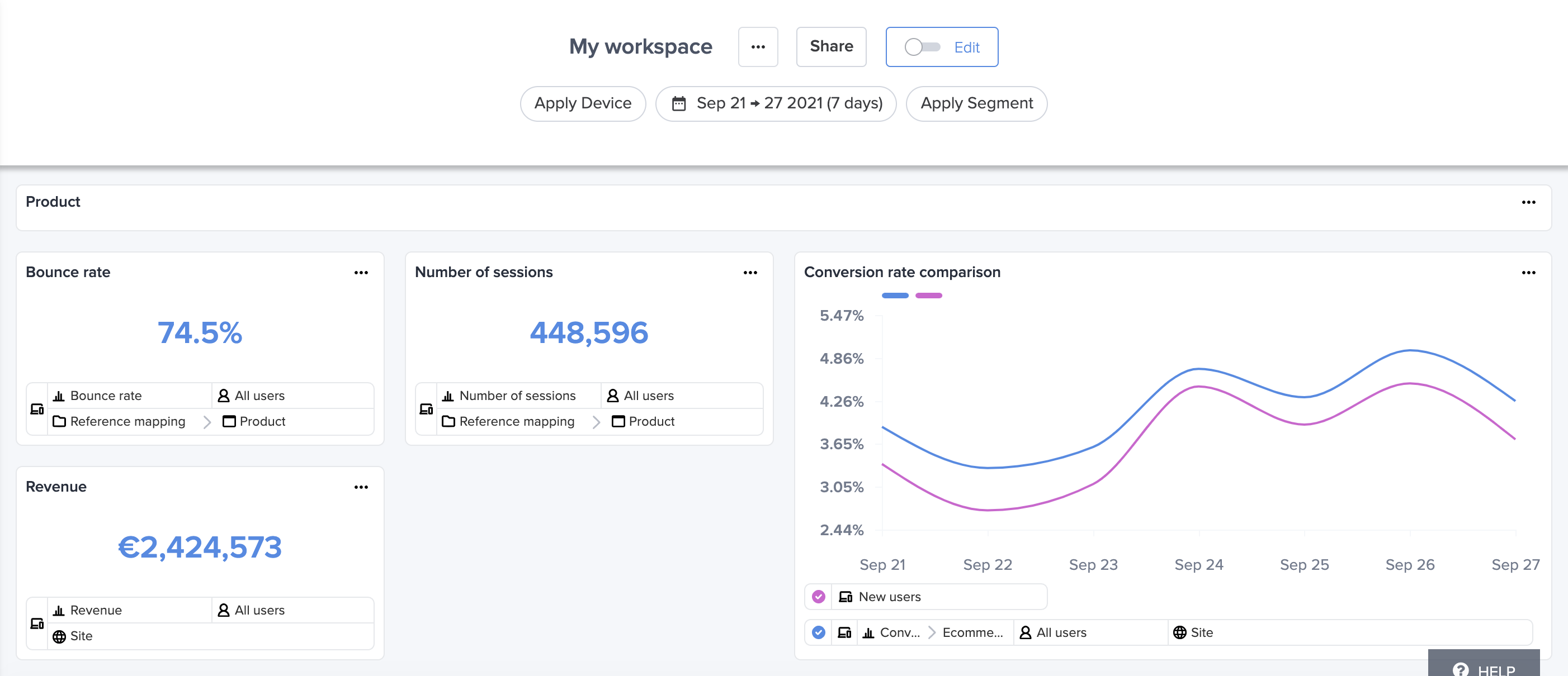
Workspace is a place for personalisation and collaboration. It allows customers to create dashboards to visualize metrics related to their websites. A dashboard is composed of widgets which represent different visualization types (single numeric value, line chart or page visualizations) and widgets are added to a dashboard using a drag and drop system.

The workspace module also enables collaboration between customers via sharing. A customer can spend time building a dashboard and then easily share it with specific people or with their entire company using a single click, enabling them to quickly access the data visualisation and thus save time.
Although the workspace module was working perfectly, we kept getting feedback from customers about the layout organization of dashboards. The drag and drop system was making it hard for customers to place a widget at a very specific position or to relocate a widget. This happens especially with a large number of widgets: the layout often breaks with some unexpected behavior and widgets a user did not intend to move can be moved accidentally.
After multiple sessions and exchanges between the product manager, the designers and the users to observe their behavior interacting with the module, we came to the conclusion that the problem was the drag and drop behavior and that it needed to be replaced with a new technology.
The designers searched for inspiration by looking at any digital interface that has the “relocating an element” behavior and came up with a few proposals that were discussed, challenged and improved by the developers and the product manager. They aimed for the right balance between desirability, viability and feasibility. During this period, several iterations of a prototype were made to have a concrete vision of what we wanted to do and also to have feedback from some selected customers which were later taken into consideration to improve the current prototype.
The result was an arrow based movement system, or click and swap. On hover on any widget, four directional arrows allow for movement. A movement can result in either the widget getting moved to a certain location if it is free (no other widget occupying that position) or it getting swapped with another widget. The movements are dictated by a movement strategy, which we will explain more precisely later on this article.

Technical solution
Before starting the implementation of our own grid layout library (that we baptised without thinking too much “the grid library”), we started by identifying the technical problems we had with the drag and drop library we were using (in addition to all the user experience issues we mentioned earlier). We used this as a guide to get to a more easy to use solution that is more tailored to our needs:
- It had too many configuration options: it is tempting to make a generic library that accepts each and every configuration possible, but if you can do everything, it means you are probably not the best at anything. So the level of genericity had to be more reasonable.
- It was not very declarative: many configuration options needed to be done programmatically (by manipulating the grid DOM instance) and by digging into low-level details. It would have been much easier to use if it was done in a declarative way. So we needed to raise the level of declarative programming.
- It was not framework-agnostic: The library we were using was Angular specific so if we ever wanted to use the same system in another App with another framework (and we sure do work with a lot of frameworks), it would have required us to find an implementation specific to the framework (or make our own). So we had to make something framework-agnostic.
Let’s start with the last point, the framework-agnostic part. You might already be familiar with the concept of Web Components. If not, and to put it simply, it is a standard allowing developers to create custom elements that work natively on the browser without any framework or library.
Suppose you created a super fancy drop down list using your favorite framework (Angular for example) and another team in your company wants exactly the same component but cannot afford the effort of re-coding it in Vue (their favorite framework).
The solution is to convert it into a web component. This will make it standard vanilla JavaScript, which can be used by either Angular or Vue while keeping the same look and feel. So for our use case, it was clear that Web Components were the way to go.
It is of course possible to build Web Components from scratch, but it is easier to go with a framework that does all the heavy lifting for you. In our case we went with Stencil. This article is not specific to Stencil so we will not go much into details about the different pros of this framework, but the main reasons for our choice were:
- Every component is compiled into a Web Component by default (no framework runtime is needed)
- We are already using it for our design system internal library
Solution design
Overview
The main idea we had in mind while designing the solution is to have a plug and play component that is easy to use, while giving the possibility to customize it if the user wants to have a reasonably customized version of the grid.
The final product looks like this:
<div> <grid-wrapper edit-mode="true"> <grid-item item-id="0" x="0" y="0" rows="1" cols="1"> <!-- Any HTML element --> </grid-item> <grid-item item-id="1" x="1" y="0" rows="1" cols="1"> <!-- Any HTML element --> </grid-item> </grid-wrapper></div>The above code is sufficient to do the following:
- Divide the available space into a grid layout of 4 equally sized columns (4 columns is our opinionated choice in case no columns attribute is specified)
- Place the items inside the grid according to their x and y coordinates
- Size the items according to the their rows and cols attributes, in case an item spans over multiple lines or columns
- Show directional arrows on top of the grid items on hover allowing the user to move them around
- Show (+) buttons on empty spaces to allow the user to add more items to the grid
- Show (+) buttons between items to allow the user to add items between grid items
With this tiny code, the display can look like this:


NB: The directional arrows and the (+) buttons are only shown when the edit-mode attribute is set to true, otherwise they are hidden.
For users who want further customization, they can achieve so by overriding the grid-wrapper attributes: responsiveness, edit-mode, number of columns, gaps, each unit width/height, all of this can be overriden.
Technical details
Let’s take a look again at the basic grid example we saw earlier:
<div> <grid-wrapper> <grid-item item-id="0" x="0" y="0" rows="1" cols="1"> <!-- Any HTML element --> </grid-item> <grid-item item-id="1" x="1" y="0" rows="1" cols="1"> <!-- Any HTML element --> </grid-item> </grid-wrapper></div>The first thing that we needed to do is to make the grid-wrapper aware of its children so it can manage them. Each grid-item should notify the grid-wrapper when it is added to or removed from the DOM.
For this, we used the connectedCallback native to Web Components, and because everything is a Web Component in Stencil (so grid-item is also a Web Component), this callback is triggered every time a grid-item is added to the DOM. The same thing applies when a grid-item is removed from the DOM, its disconnectedCallback is triggered.
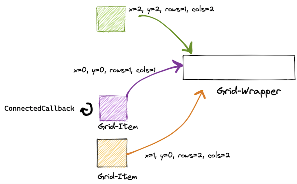
This behavior can be seen in the schema below, each time a grid-item is added it notifies the parent (grid-wrapper) passing to it its attributes (mainly position, dimensions, and a reference to its HTML element). This will allow the grid-wrapper to construct a State.

The state is a 2D matrix allowing us to represent the elements on the grid with their positions and dimensions. It contains object representations of the grid items positioned on the matrix based on their positions on the view. It is our model.

The state is directly linked to the view, each time it changes it triggers a re-render of the view. This allows us to handle grid items movements efficiently.
Let’s suppose an item A wants to move to the right, and there is no item in the desired position, all we need to do is to move its corresponding representation object on the state matrix from (line-y, col-x) to (line-y, col-x+1). When the state changes, it will trigger a re-render of the view, and place the corresponding grid-item accordingly on the view.

Because everything is handled through a state machine, one could even redefine what should happen when an element is moved, added or resized. In our case, we think that when an element is moved on top of an existing one then they should swap, but maybe you would prefer them to be pushed? By writing your own movement strategy function you can override the default behavior to suit your needs. The same goes for the adding strategy (to append elements to the grid) and the resize strategy. The strategies are pluggable functions that take the current state of the grid as a parameter, plus any necessary information, and produce a new state.
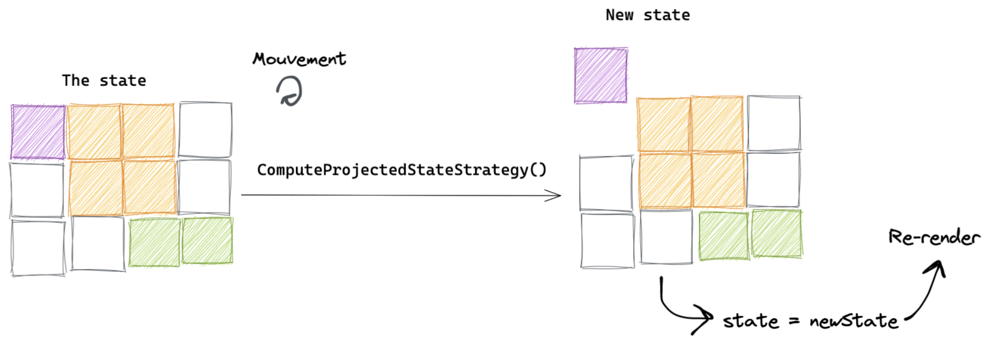
Let’s take the movement strategy as an example. The schema below represents a use case where we want to move a grid-item up by clicking on its “up” direction arrow.

Each time an element wants to move, it sends an event to the grid-wrapper containing the item ID and the direction to which it wants to move to. The grid-wrapper calls its movement strategy via the method: ComputeProjectedStateStrategy(currentState, itemToMove, direction) => newState
This method calculates what will be the next state (projected state) if we indeed move this item to the top. The projected state can be null to indicate that a movement in this direction is not possible.
If a movement is possible (the movement strategy produces a new valid state), we set the current state of the grid to this projected state. And as we said earlier, the state is tied to the view, so this triggers a re-rendering of the view, and we will visualize our grid-item moved to the top. This can be visualized in the schema below.

The same logic goes for the other strategies. If a user wants to implement a different movement strategy, all that is needed is to provide a method with the same signature as ComputeProjectedStateStrategy.
Testing
We tried to focus our tests on the most important part of the system, that is the state of the grid, thus we tested all possible use cases on moving or resizing items.
Knowing that each action (move or resize) results in a new GridState, we split our unit tests to check only one action at a time instead of chaining multiple actions on a given single test (the output of one action could be the input of a new unit test). So, we constructed lists of test cases respecting the following interfaces:
{ description: string; action: { itemId: string; // id of item being moved/resized direction: Direction; // target direction of the move size: number; // requested size }; initial: GridState; expected: GridState;}Finally, we run our ComputeProjectedState strategy on the initial state and expect to correctly compute the next state as expected.
Knowing that it would be a headache to debug failing tests, if any, we bootstrapped a small Stencil app that, given the same tests lists, renders the initial, result vs expected state for each test. It also highlights, at the top section of the app, the test description, the item color being moved/resize and the direction of the move / the requested size.


Conclusion
What started as a revamp became a lightweight generic grid library. Our composition-based approach consisting of offering a very simple declarative API to the developer and allowing custom behavior injection paid off. It made the developer experience very smooth and opened the door for the library to be used within other teams. Using a framework-agnostic approach by exposing the library as a Web Component was also a huge enabler for this.
All this would not have been possible without a tight collaboration of all the actors within the team. All players contributed to a continuous improvement loop: designers provided prototypes, developers challenged them and the whole team tested them. It provided precious feedback that helped us get to a mature solution. The resulting product offers a much-improved user experience compared to what we had before, and the customer feedback is very positive.